Retail lighting
Retail lighting should never be a simple “make it bright enough” exercise. Lighting is a tool that directly influences dwell time, perceived product quality, wayfinding, and the consistency of a brand experience across every store.
The most successful retail environments balance compliance and visual comfort with theatre, contrast, and brand storytelling. Our team has many years of experience delivering retail lighting projects across a wide range of sectors, and the principles below represent the key considerations we apply consistently.
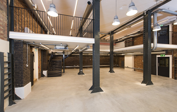
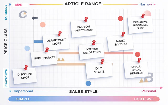
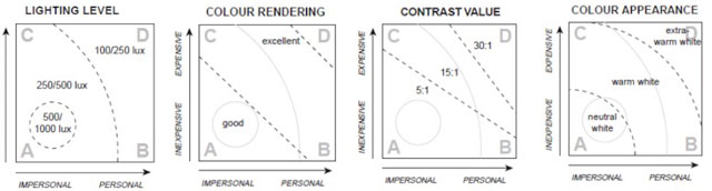
At its core, good retail lighting is about balance: between general lighting, feature lighting, and display lighting. That balance is not fixed; it depends heavily on the retail profile. A useful way to frame this is through A. van Gils’ four-corner retail design philosophy. Every shop sits somewhere on a spectrum, from inexpensive and impersonal with a wide product range (such as discount retailers or budget supermarkets), through to expensive, exclusive, and personal environments with a narrow product range (such as high-end fashion, jewellery, or technology brands).
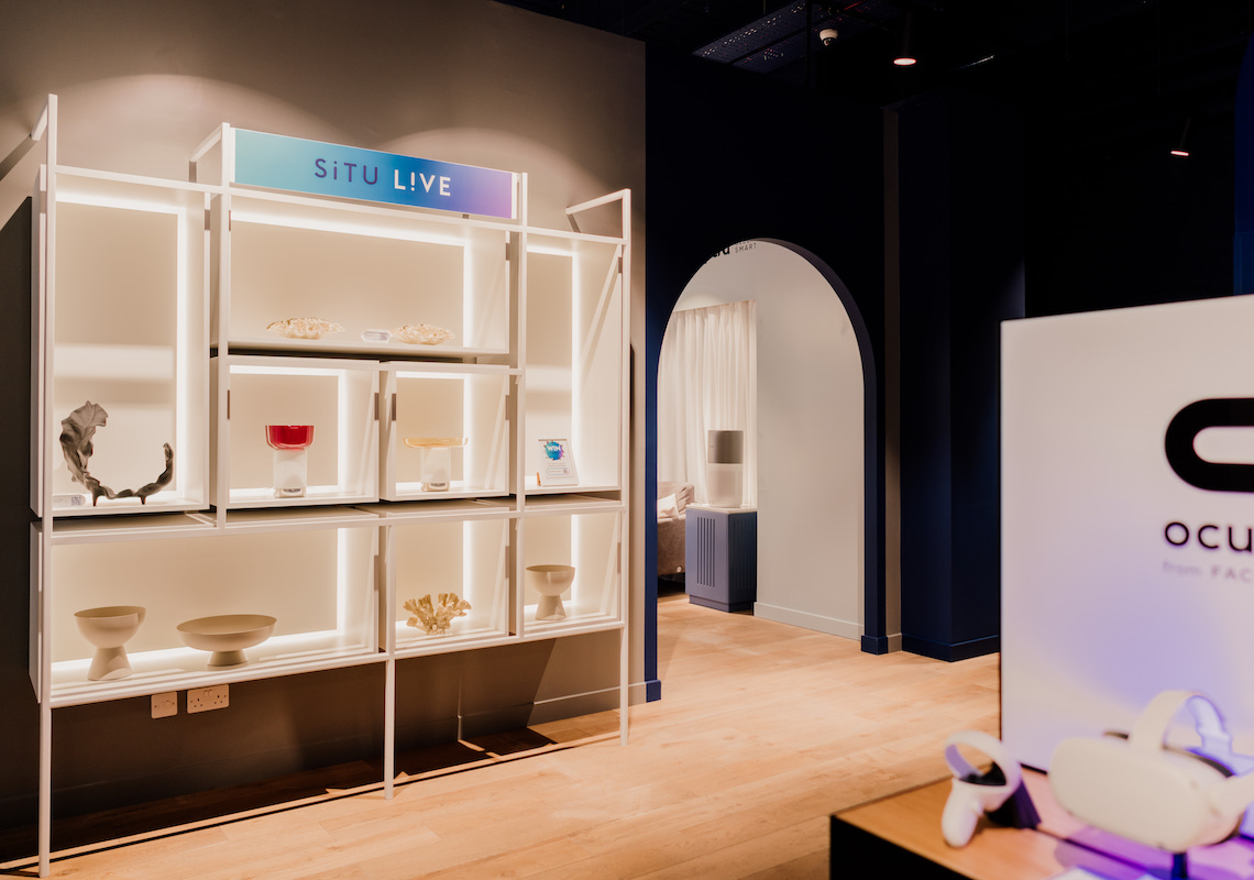
At the value-led end of the spectrum, shops typically rely almost entirely on uniform general lighting, with little or no accent or display lighting. Average illuminance levels are often in the range of 500–1000 lux. In contrast, an exclusive retail profile relies on a high density of strong accent lighting, supported by deliberately lower general lighting levels, typically around 100–200 lux. This lower ambient illuminance is essential to allow accent lighting to read clearly and create hierarchy, contrast, and focus.
Colour temperature
Correlated colour temperature (CCT), measured in Kelvin, is one of the fastest ways a customer subconsciously “reads” a space. It sends an immediate commercial signal, and warmer light is often perceived as more premium.
In broad terms:
– Warmer light (typically 2000–3000 K) is associated with intimacy, hospitality, craft, and exclusivity
– Neutral light (around 3500–4000 K) feels modern and clean
– Cooler light (4000 K and above) can feel clinical, impersonal, or inexpensive
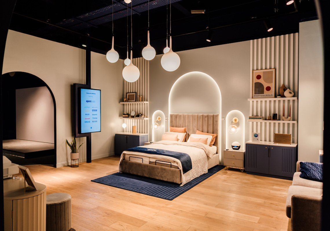
For higher-end and more exclusive brands, we typically use warm white. Warmer CCT’s makes materials such as timber, leather, and metal appear richer, reduces the perceived harshness of shadows, and flatters skin tones. It also supports a lower ambient lighting strategy, where accent lighting on the displays does the selling. This is a technique we frequently use in premium retail environments.
Premium does not simply mean “warm everywhere.” Instead, we establish a clear hierarchy, with warm ambient light and warm-to-neutral accent light carefully tuned to the product category, interior finishes, and the brand’s intended mood. For example, a luxury jewellery concept may sit warm overall, but we select specific colour temperatures and optics to create crisp sparkle without making diamonds or silver appear yellow.
Colour rendering
Colour rendering is critical in retail lighting, as it directly affects how merchandise is perceived. It is especially important in fashion, cosmetics, DIY (paint), and food stores, where colour accuracy influences purchasing decisions.
An often-overlooked but vital area is fitting rooms. Unflattering skin tones, excessive shadows, or harsh direct light at mirrors can easily deter a purchase. As a baseline, we typically specify CRI (Ra) 90+ for all merchandise areas, increasing to 95+ for colour-critical applications. Where appropriate, we also consider TM-30 metrics (Rf and Rg) to better control colour fidelity and saturation, particularly in sectors such as cosmetics.
Lux levels and accent ratios
There is no single definition of “good” illuminance in retail. Lux levels should be driven by task, merchandise type, customer age profile, surface reflectances, and the desired level of contrast.
Typical maintained illuminance starting points we use include:
– Sales floor ambient: 150–250 lux
– Point of sale / cashier desks: 400 lux
– Fitting rooms: 300 lux
– Circulation and wayfinding zones: 50–100 lux
– Display accent lighting: 1500 lux
– Promotional or hero areas: up to 2000 lux
Drama in retail lighting is created through controlled contrast between ambient and focal light. A 3:1 contrast ratio provides noticeable emphasis, while 5:1 delivers clear visual impact. We generally aim for around 10:1, as this produces a strong focal accent. Ratios of 15:1 or higher can be used for very dramatic “hero” moments.
Cylindrical illuminance
Cylindrical illuminance is a fundamental, and often overlooked, aspect of retail lighting. It refers to the vertical light that models faces and forms, rather than horizontal light falling on the floor.
In retail environments, vertical and cylindrical illuminance are often more important than horizontal lux. Shopping is a social activity, and particularly in higher-end stores, face-to-face interaction with sales staff plays a key role. Faces need to be well lit with soft, flattering light to support communication and comfort. As a guideline, we typically target cylindrical illuminance values of around 150 lux on the sales floor and at points of sale.
Key UK regulations and guidance
Retail lighting must comply with a number of regulations and standards. Key requirements include:
– Workplace (Health, Safety and Welfare) Regulations 1992, Regulation 8, which requires suitable and sufficient lighting in workplaces, including retail back-of-house areas and staff-operated front-of-house zones
– Building Regulations Part L, which sets energy performance requirements and places emphasis on lighting efficiency and controls
– Emergency lighting, typically designed to BS EN 1838 and associated UK standards to ensure safe egress during power loss
Commonly used design guidance includes:
– BS EN 12464-1:2021, which provides the technical framework for illuminance, glare, and colour quality
– CIBSE / SLL Lighting Guide 17 (LG17): Lighting for retail premises, which remains the UK’s primary retail lighting reference for typologies, accent strategies, daylight integration, and controls
A new era of retail
High streets are increasingly competing with frictionless online shopping by leaning into what e-commerce cannot replicate: atmosphere, discovery, social energy, and theatre. Retail is shifting toward a destination mindset, and lighting is central to this change because it can transform experience without altering architecture.
On many of our retail projects, we use pixel LED systems and interactive lighting triggers, such as sensor-driven highlights, responsive feature walls, or timed lighting moments that encourage engagement and social sharing. Layered lighting with content projection, neon-style signage, and digital displays also plays a key role in creating engaging physical environments.
When used strategically, lighting becomes a core part of brand identity. Retail brands invest heavily in visual language: colour, typography, materials, and tone of voice. Lighting should be treated in the same way. It is one of the few design elements that can change by time of day, season, campaign, or trading pattern without rebuilding the store.
A documented lighting strategy typically defines:
– The brand’s “home” CCT range and permitted variation across zones
– Vertical illuminance principles for faces, mannequins, and wall-mounted products
– A signature contrast language that defines how dramatic the store should feel
– Feature moments such as entrances, hero bays, points of sale, façades, pixel LED elements, interactive triggers, projections, and digital signage
When this strategy is clearly defined and rolled out consistently, lighting stops being a store-by-store exercise and becomes a scalable, repeatable part of brand identity and governance. If you need help with lighting design on a retail project youre working on then please get in touch, our team would love to help.